Aesthetics of branding raised by the Twosome Place ‘Hangeul Symbol’ up…
페이지 정보

본문
Aesthetics of branding raised by the Twosome Place ‘Korean symbol’ uproar: Innovation or misunderstanding?
Written on: June 13, 2026 | Column by current affairs critic specializing in IT/media
The ‘Korean symbol’ image of Twosome Place, which recently heated up online communities and SNS, has become the center of heated debate among numerous coffee lovers and netizens. This unfamiliar logo, which suddenly appeared as if it were an April Fool's Day prank, dominated real-time search terms and bulletin boards, giving rise to speculation that it was a 'comprehensive brand overhaul'. Regarding this design, which is a strange combination of English and Korean alphabets, consumers expressed both doubts about its readability and praise for its Korean aesthetic. Was this symbol simply a design experiment, or was it a growing pain experienced by a brand we are familiar with in the process of attempting change? Through this incident, we would like to analyze in depth the flip side of the brand strategy pursued by A Twosome Place and the challenges they face in communicating with the public.
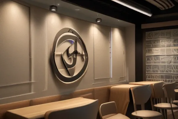
The symbol design at the center of the controversy was created by combining the English letter ‘T’, which symbolizes ‘TWO’, and the Korean letters ‘ㅆ’ and ‘ㅁ’, which make up the pronunciation of ‘SOME’. Some expanded graphics even contain the philosophical meaning of connecting people with the spirit of the Korean traditional ‘Dorae Knot’. Twosome Place clearly drew the line that this design is a sub-graphic introduced on a pilot basis in the space production and package design of some stores, including the Gangnam branch and Anguk branch, as part of the next-generation premium store ‘Twosome 2.0’ project introduced last year. In other words, there was no intention at all to replace the existing brand identity (BI) familiar to the general public, and it was one of the design assets to strengthen its identity as a premium brand. Nevertheless, when this image was exposed to the public during the trademark registration process, consumers misunderstood this as a complete rebranding and began to argue.
Consumer reactions online were very divided. Those with a negative view pointed out that the design was significantly less intuitive. Criticisms such as “It is difficult to understand the meaning without listening to the explanation” and “It looks more like a symbol or traditional pattern of a public institution than a cafe” were reactions that arose as a result of a conflict with the existing sophisticated image of the brand. On the other hand, consumers who gave positive evaluations highly evaluated the attempt to use ‘Hangeul’ as a design element in a market overflowing with global franchises. The analysis suggests that the fact that it breaks away from the typical cafe logo depicting coffee beans or a coffee cup and reveals Korean individuality is fresh enough as a differentiation strategy for the brand. This difference in response clearly shows the gap between ‘familiarity’ and ‘newness’ that the public expects from the brand.
This happening suggests the fierce competitive environment the coffee industry is currently facing and the importance of rebranding strategies. As the strong fandom of Starbucks' Siren has recently been shaken by owner risk and social controversy, the market is accelerating the movement to absorb lost consumers. While low-price coffee brands are growing in size by leveraging overwhelming accessibility, premium brands such as Twosome Place are faced with the challenge of providing a new spatial experience beyond the unique competitiveness of ‘pairing cake and coffee’. The ‘Twosome 2.0’ project is not a simple logo change, but a strategic step to deliver differentiated value to customers through premium stores. Even though the sub-graphic did not completely gain public sympathy, this attempt is proof of the brand's will to constantly evolve rather than stagnate.
Corporate branding is not simply the act of changing the logo, but the process of imprinting the brand's philosophy in the minds of consumers. A Twosome Place's immediate clarification through its official SNS was an essential response to prevent confusion among franchise owners and consumers and maintain brand trust. Preemptively registering trademarks for design assets is a company's natural right and protection strategy, but in the process, it leaves behind a lesson that unexpected misunderstandings can arise if the speed of communication with the public does not keep up. In conclusion, this uproar served as an opportunity to reaffirm the brand power of A Twosome Place, and it remains to be seen how they will communicate with customers and implement their design philosophy as a premium brand in the future.
■ Conclusion and analysis outlook
A Twosome Place’s ‘Korean symbol’ uproar goes beyond a simple design incident and is an example of how brands should communicate in a changing market environment. The public is wary of a familiar brand suddenly changing its identity, but at the same time has a dual attitude of looking forward to unique changes. Through this incident, A Twosome Place may have realized that a detailed communication strategy is needed to effectively convey the premium goal while maintaining the brand's core identity. We hope that the various experiments that A Twosome Place will attempt in the future will overcome public misunderstandings and further solidify its unrivaled position as Korea's leading premium cafe brand.
* This post is an analysis column that is automatically recreated in the style of a current affairs critic's commentary by analyzing real-time Google Trends popular search terms and related major articles.
- 이전글찰나의 아찔함과 드라마의 반전, 야구장에서 마주한 희비의 교차점 26.06.13
- 다음글교정 시설의 구멍 뚫린 보안망, 사라진 실탄 100발이 던지는 경고장 26.06.13
댓글목록
등록된 댓글이 없습니다.